How To Choose The Best E-Commerce Platform? Best E-commerce Platform...


How To Choose The Best E-Commerce Platform? Best E-commerce Platform...
In What Ways Can Video Marketing Help My Business? Benefits...
Mobile Web and App Strategy Mobile Search Experience Mobile Search...
Mobile Web Design Problems & Solutions Mobile-friendliness How to Achieve...
Ecommerce Website For Small Business: What to Focus On? Trends...
Automotive Dealership SEO Campaign Building And Running A WordPress Website...
4 Strategies To Get Media Publicity Without Pitching Strategies To...
How Does Google Retargeting Work? Google Retargeting Allows online businesses...
Meet Our Clients: Tutor Bright | Video Production At Nova...
Master Mobile E-Commerce Optimizing Your Website Why You Must Master...
The Importance of Web Design & Social Media For Businesses...
How Can I Get More Traffic to My Website or...
The Art of Republishing Old Content It is not possible...
What are the Worst Design Flaws for Law Firm Websites?...
What Is Baidu Search Engine? Chinese Search Engine Promising Growth...
Top SEO Trends That Dominated 2017 Constantly Evolving Search Engine...
What Internet Marketing Services Do I Need for My Company?...
Google’s New Mobile-Friendly Ranking Algorithm Will Affect Search Engine Optimization...
Steps To Take To Make Sure Your Website Is Mobile...
10 Proven SEO Techniques For 2018 SEO Techniques Significantly improve...
Some Strategies That A Good Toronto SEO Company Will Do...
Should I Be Using Social Media Analytics Tools? Social Media...
Keyword Research For Search Engine Optimization Keyword Research Optimizing Your...
SEO Budgeting & Service Providers Online Marketing Budget Сhoose an...
Tips For Improving Website Design In Order To Increase Conversions...
Review Management Online Reviews From Customers Business’s Reputation No matter...
Using Pinterest For SEO And Your Business In Toronto Creating...
Local SEO For Multiple Locations Local SEO SEO Techniques It’s...
3 Practical Ways To Improve Your Domain Authority Improve Your...
How Can I Build My Brand with Internet Marketing? Build...
How To Optimize Your Law Firm Online Presence A high...
A Look at Intelligent Web Design Now and in the...
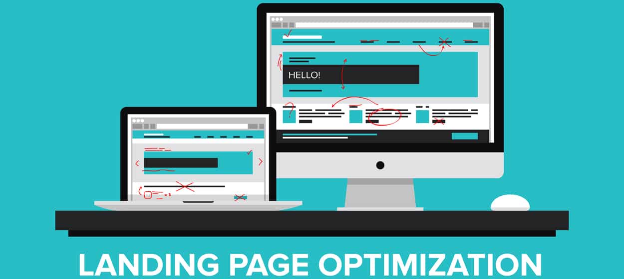
How Can I Create a Better Landing Page for More...
What Are The Elements Of Good Interaction Design? Good SEO...
What Are Some Unique Tactics Offered by SEO Companies? Unique...
How To Optimize Your Web Pages To Appear As Featured...
Top 7 Google Ranking Factors in 2021 SEO is the most...
SEO During Covid-19 The coronavirus has greatly increased internet usage...