Mobile Web and App Strategy Mobile Search Experience Mobile Search...

Mobile Web and App Strategy Mobile Search Experience Mobile Search...
How To Find Good Web Designers Working With Web Designers...
Some Benefits Of Outsourcing Web Design Work Business Growth You...
Adwords Management: The Effectiveness Of Call Extensions Adwords Management Call...
Mobile Web Design Problems & Solutions Mobile-friendliness How to Achieve...
Flat and Minimal Website Design Tips 3-D Websites How to...
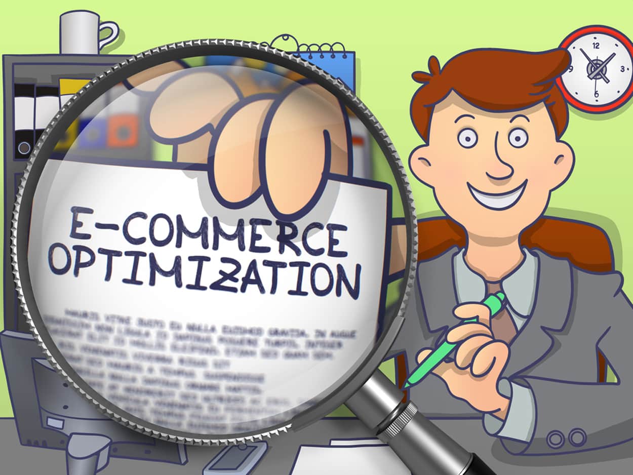
How Can Remarketing Company Services Help With E-Commerce? Remarketing Company...
Custom Shopping Cart vs Generic Shopping Cart An Online Store...
5 E-commerce Stores With Impressive Shopping Experience E-commerce Websites Following...
7 Simple Design Tweaks & Tips for Your Website Website...
Why To Consider A Live Chat Feature On E-Commerce Site?...
Planning for SEO Success Online Marketing For SEO Success Consistent...
How Do I Get Started With A Google Remarketing Campaign?...
My Website Was Penalized By Google! Can You Help? When...
How To Get Started With Your Toronto SEO Campaign? SEO...
Changes In The Web That Are Important To Note Changes...
Ways To Make Your Online Shopping Website Design Unique Online...
Advantages vs Disadvantages Of A Custom E-commerce Website E-commerce Industry...
Why We Should Build Links From The Same Website In...
What Can We Expect From Magento 2.1? Magento 2.1 Learn...
Using Pinterest For SEO And Your Business In Toronto Tips...
Web Design Vs. Web Development: What’s The Difference? Web Design...
Fact or Fiction? Exploring Prevailing SEO Superstitions Prevailing SEO Superstitions...
6 Factors to Consider When Choosing the Right Web Design...
A Guide to the F Pattern Layout for Text-Heavy Websites...
Some Strategies That A Good Toronto SEO Company Will Do...
Is WordPress For Blogging? Advantages of WordPress Isn’t WordPress Just...
How Can I Use Facebook Remarketing Effectively? Social Media Marketing...
Effective Types of Personalized Product Recommendations An E-commerce Store Effectively...
E-Commerce Tools For Website Design Types of Tools An Overview...
What Are SEO Techniques For Honest Link Building? Which Methods...
Should You Focus On Page Rank Or Domain Authority? Page...
Choosing The Best Web Design Company 5 Important Questions To...
What Is Google PageRank Does Google PageRank Really Matter? Search...
Machine Learning & How It Affects SEO Industry Machine Learning...
Google’s Local 3-Pack Google Local Pack Maintaininh Their Competitive Edge...
What are some common mistakes when it comes to marketing...
Guide To SEO for E-Commerce Websites The Importance of SEO...
Do I Need A Professional Website Marketing Company? Tools For...
Ecommerce Traffic Sources Robust Ecommerce Website Digital Storefront Ecommerce is...
Effectively Find Customers For Your Toronto Business With Local SEO...
Learn About SEO In Toronto With These Helpful Guides &...
How Can I Build My Brand with Internet Marketing? Build...