
How To Get Started With Your Toronto SEO Campaign? SEO...
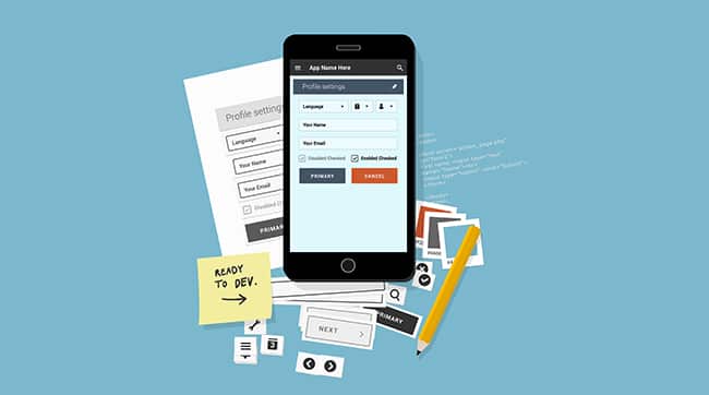
We are living in the age where people prefer to use their mobile devices to access websites. Make a point of ensuring that your business website works exceptionally well on smartphones. The design elements should be structured to fit the smaller screen sizes of mobile devices so that the website renders properly when opened in a mobile browser.
There are numerous advantages of going for a mobile friendly website design. For a start, the mobile version will load faster helping you to reduce your site bounce rate and improve conversions. Additionally, mobile friendly websites are easy to navigate which ensures that your users find anything they are looking for quickly. With that said, let’s look at a few simple ways to ensure your website is mobile friendly.
When narrowing down your options on what design or theme to choose for your business website, settle for those that are responsive. A responsive design will adjust to different screen sizes automatically. Content management systems like WordPress have lots of responsive designs to choose from. It’s going to be easier and cost effective when you select a responsive design rather than having two separate websites to choose from
When you have too much content on your website, it becomes really hard for mobile users to follow through. Eliminate the complication by providing minimal content for mobile users. Avoid long sentences and break down paragraphs. Avoid too many images on a web page. Prioritize on what content is important to show mobile users. Make sure the content is properly arranged in a single column so that it displays nicely in a mobile device.
Make sure any images or videos on your site are optimized for mobile devices. Upload images that are resized so that they can fit properly on the mobile version of your website. You can also compress the images so that they don’t interfere with the site load speed. Always ensure any images you upload on your site are clear.
Flash players and pop-up ads may not work well for mobile users. Flash often creates issues since most mobile devices no longer support it. Pop-ups are rather annoying and they give users a bad experience. The key is to maintain simplicity and still keep web users hooked to your page for longer.
The typography you choose for your website should also be enticing to mobile users. Don’t choose a font that is too big or too small for your mobile website. Most people will simply click away if they can’t read the content on your website.
Take the steps above to make your business website mobile friendly and you’ll notice an increase in leads and conversions from mobile traffic.
How To Get Started With Your Toronto SEO Campaign? SEO...
Mobile Web Design & Compatibility Website On Mobile Device How...
SEO Tips When Targeting Queries With Low Search Volume High...
What Are Some Of The Top Online Marketing Mythis? Online...
Techniques For Good Website Development There is nothing constant with...
Automotive Dealership SEO Campaign Remarketing Services for Online Business Advertising...
How Do I Get Started With A Google Remarketing Campaign?...
How To Turn Your Social Media Followers Into Customers Turn...
Avoid Overloading Your Website With SEO Content Quality SEO Content...
Social Media Platforms For SEO How Does Social Media Help...
Hyperlocal Marketing – What Is It? Hyperlocal Marketing Local Search...
How To Optimize Your Web Pages To Appear As Featured...
The Importance Of Colours In Web Design Mix Shades And...
What Is Google AdWords And Why Should I Use It?...
Why Faceted Navigation Is Not Good For SEO Undermined SEO...
Should You Focus On Page Rank Or Domain Authority? Page...
What Are Some Unique Tactics Offered by SEO Companies? Unique...
Strategies For Choosing The Best Online Marketing Agency Selecting An...
How To Use Competitor’s Top Pages Data For SEO Determine...
Responsive Website Design: One Site Fits All Investing in a...
6 Product Design Principles Every Organization Can Adapt Product Design...
How Do I Measure The Success Of My PPC Campaign?...
Can Link Building Hurt My SEO? Creating High-quality Content Don’t...
Ways To Make Your Online Shopping Website Design Unique Online...
Want to Create an Ideal Ecommerce Site? Here is What...
Nova Solutions Supporting Young Entrepreneurs In The City of Toronto...
Tips To Ensure Your Readers Quickly Grasp Your Message Ensure...
Why You Must Work With SEO Companies in Toronto That...
Why To Consider A Live Chat Feature On E-Commerce Site?...
How Can I Use Facebook Remarketing Effectively? Social Media Marketing...
Benefits Of Using Web Design Templates Types of Templates You...
How To Update Website By Yourself Design Changes Can I...
My Competitor’s Traffic Research How Much Traffic My Competitor’s Sites...

Nova Solutions Headquarters
700 University Ave, Toronto, ON M5G 1X6
Tel: +1 800-790-3082
Office Hours: M-F 9am – 9pm
Copyright © 2021 Nova Solutions Corporation | All Rights Reserved.
Working with Third-Parties
A good website starts with stunning design. As the Lead Designer at Nova,
Andrew uses his vast experience with web development, graphic design &
brand building to create the majority of our web portfolio. He has worked
with many CMS & commerce products and has built innumerable websites.
Andrew excels at creating stunning (UXD) User Experience Design and
endeavors to put a little bit of soul in every web design project so that it may
have a life of its own.
Kevin is a strategic thinker that can quickly evaluate and find creative
solutions to challenging digital problems. Since 2001, he has been
developing solutions that not only maximize digital presences
but that also have the most impact on markets.
Kevin is a Senior Consultant at Nova Solutions who is passionate about SEO,
user experience and conversion optimization.