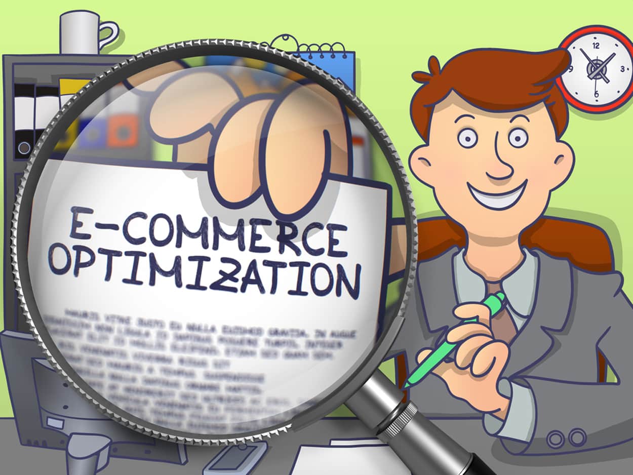
Ecommerce Conversion & Optimization Landing Page Optimization Attaining Higher Sales...


Ecommerce Conversion & Optimization Landing Page Optimization Attaining Higher Sales...
Should You Focus On Page Rank Or Domain Authority? Page...
What Is Google PageRank Does Google PageRank Really Matter? Search...
Advantages Of Custom Web Design Having A Customized Website The...
What Should I Include In My SEO Checklist? My SEO...
What Are The Best Free WordPress Plugins? Content Management System...
Features That Impact Your Adwords Advertising Performance Google AdWords AdWords...
What Are Some Methods For Retargeting Toronto Consumers? Methods for...
Is Your Page Considered Low-Quality By Google Effective SEO Strategies...
How Can Remarketing Company Services Help With E-Commerce? Remarketing Company...
Website Marketing Services We Offer Effective Website Marketing Services Are...
Definition Of Off-Page SEO What Is Off-Page SEO? Increasing Site’s...
How Do I Get Started With A Google Remarketing Campaign?...
What Makes A Good Web Design Company? Professional Design What...
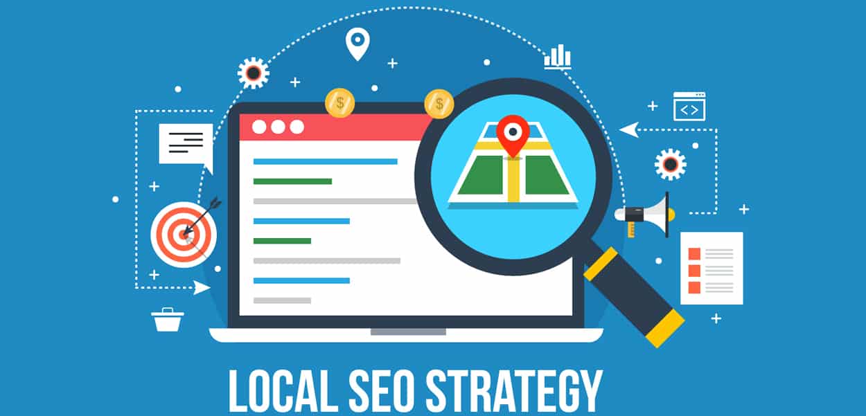
How To Improve Your Local Online Marketing Local Online Presence...
Professional Looking Websites Are Crucial To Your Business Online Businesses...
Creating An Effective SEO Strategy Growing Online Presence Time And...
Web Design Trends and Features Techniques for Good Website Development...
What are the main stages of a website design? As...
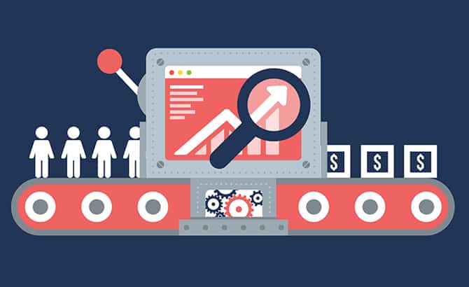
How Can I Get More Traffic to My Website or...
7 Simple Design Tweaks & Tips for Your Website Website...
Infographics: Common Myths About Presenting Data Visually Infographics Deeper understanding...
What is Magento Website Development? How Does It Work? An...
Which Retargeting Company is the Best? “Best” Retargeting Company What...
What Are Some Unique Tactics Offered by SEO Companies? Unique...
Is WordPress For Blogging? Advantages of WordPress Isn’t WordPress Just...
How To Design A Website That Generates Conversion Good Web...
Why You Should Work With An SEO Agency That Ties...
Advantages vs Disadvantages Of A Custom E-commerce Website E-commerce Industry...
Bolding And/Or Italicizing Keywords How Do I Effectively Use Typography?...
Going From Brick-and-Mortar to The Internet E-Commerce Internet E-Commerce Online...
What Is Canonicalization What is The Process of Canonicalization? Canonicalization...
Guide To SEO for E-Commerce Websites The Importance of SEO...
How To Market A Website If I Already Have Customers...
Why Consider Bing for SEO Strategy? Search Engine On The...
Automotive Dealership SEO Campaign Building And Running A WordPress Website...
Hottest Trends In Ecommerce Web Development Ecommerce Web Development Current...
Flat and Minimal Website Design Tips 3-D Websites How to...
Is PPC Advertisement Worth My Time? PPC Advertisement Catches Attention...
Custom Shopping Cart vs Generic Shopping Cart An Online Store...
Bad SEO Habits To Stay Away From Identify Your Bad...