SEO Backlinks – What are they? Learn How to Build...
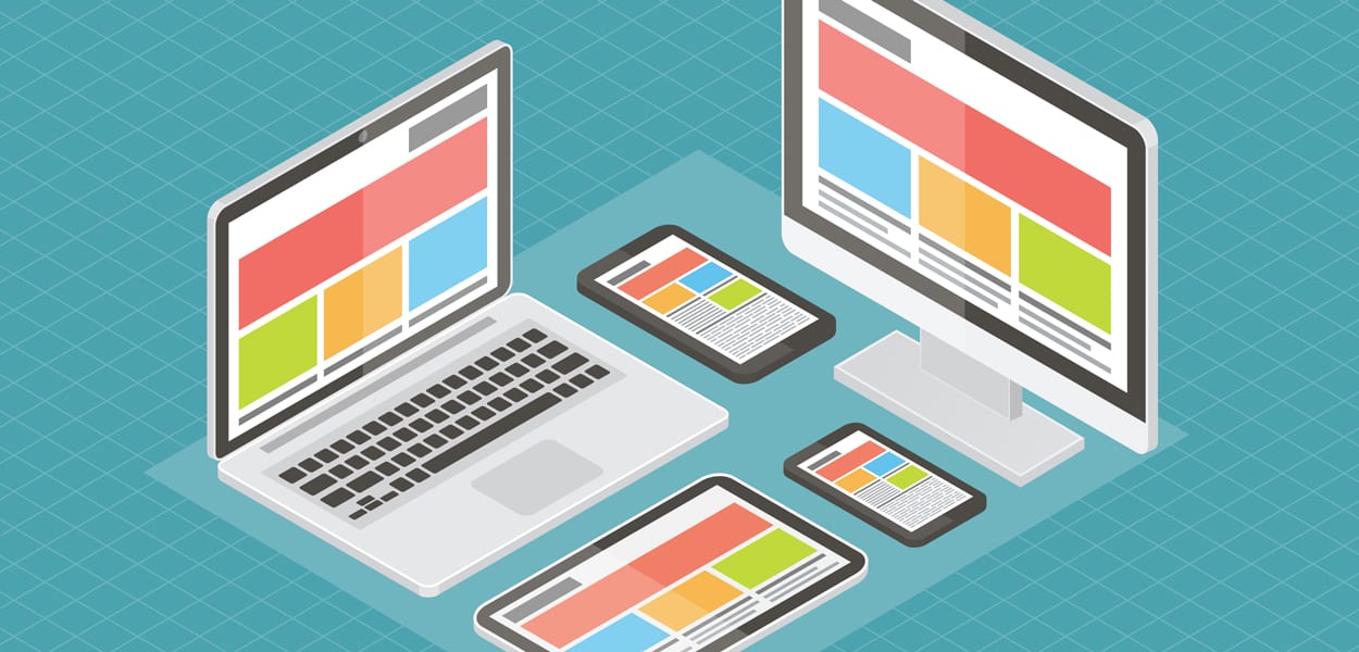
How your site looks will vary somewhat depending on the size of screen and type of device that people are using when they view your website. In fact, the same website can even look different depending on the browser that the user it viewing it from. For this reason, it is important that your web designer creates a website that is both optimized for different browsers as well as being mobile friendly.
First of all it is not important that all of your information is viewed exactly the same way on every browser and device. In fact, in many cases it may not make sense for it to be viewed the same way on different devices. What is important is that your content makes sense in every browser and device and that you provide a positive user experience in every browser and device. If your website does not look right in certain browsers, it is generally due to compatibility issues. As part of our web design services, we make sure that your website looks professional on all platforms. In some cases it may be best to direct some devices – such as phones and tablets – to completely different websites.
Whether you decide to have a separate mobile site or a site that is mobile friendly will depend on your budget as well as you business’s specific needs. Our website designers can help you to determine which choice is best for you.
Creating a mobile version of your site tends to be less costly than redesigning your entire site to be mobile friendly. One of the trade-offs however, is that with a new url, it may not get as good a ranking in search engines as your original site. This is likely to be the case at least in the beginning.
A better solution – especially if you are planning a new design (or redesign) anyway is to build a site that works well on all devices. This can be achieved through either adaptive design or responsive design.
This is the more expensive option of the two and is usually the choice of very large companies. With adaptive design, the website detects the type of device that is being used and then adapts itself to be viewed on that device.
Responsive design is less costly than adaptive design and still works well for most small to medium enterprises. This type of web design uses a technology called Cascading Style Sheets (CSS) to create a website that auto-adjusts to the device being used. It works on everything except very old cell phones and is a great choice for many businesses.
Regardless, of which you choose, it is important to have a website that people can easily view and use with their telephones. The amount of online traffic coming from mobile devices has increased dramatically in the past few years and this trend is only likely to increase.
Ensuring that your website is viewable on many types of device will help to ensure that you get good value for your investment.
How Healthy is Your Magento store? Magento undoubtedly is one of...
Tips For Web Designers: How To Increase Productivity Tips For...
What Is Google AdWords And Why Should I Use It?...
Optimizing Website For Voice Search Optimizing Website For Voice Search...
Factors Determining Your Search Engine Optimization Needs SEO Factors Determine...
Automotive Dealership SEO Campaign Remarketing Services for Online Business Advertising...
10 Proven SEO Techniques For 2018 SEO Techniques Significantly improve...
The Importance of Web Design & Social Media For Businesses...
Domain Authority and Links Local Search Ranking Search Engine Marketers...
Guide To SEO for E-Commerce Websites The Importance of SEO...
How To Find Good Web Designers Working With Web Designers...
Mobile Web and App Strategy Mobile Search Experience Mobile Search...
Tips For Designing An Innovative And Functional Website Navigation 5...
WordPress SEO Mistakes That People Make When Starting Out WordPress...
Meet Our Clients: Tutor Bright | Video Production At Nova...
A Guide to Boosting Your Website Speed Responsive Web Design...
Blog Search Engine Marketing Benefits & Ideas For Local SEO...
What Are Some Good Google Remarketing Practices? Google Remarketing Practices...
Ecommerce Traffic Sources Robust Ecommerce Website Digital Storefront Ecommerce is...
Tips For Improving Website Design In Order To Increase Conversions...
A Guide To YouTube Search Engine Optimization Techniques YouTube Search...
How To Design A Website That Generates Conversion Good Web...
How To Update Website By Yourself Design Changes Can I...
How To Turn Your Social Media Followers Into Customers Turn...
Bad SEO Habits To Stay Away From Identify Your Bad...
Creating An Effective SEO Strategy Growing Online Presence Time And...
6 Pay Per Click Advertisement Tips For Startups Pay Per...
Understanding the Importance of SEO for Toronto Businesses Good SEO...
Hottest Trends In Ecommerce Web Development Ecommerce Web Development Current...
Video Optimization Guide For Search Engine Optimization How to Utilize...
Developing Website Marketing Strategies How Website Design Impacts on Your...
Ecommerce Website For Small Business: What to Focus On? Trends...
What Are SEO Techniques For Honest Link Building? Which Methods...
A Look at Intelligent Web Design Now and in the...
Working With An SEO Company In Toronto For Google News...
Some SEO Agencies Limit Keywords Why Do Some SEO Agencies...
Some Strategies That A Good Toronto SEO Company Will Do...
The Four Most Important Ranking Factors For SEO In Toronto...
How Do I Get Started With A Google Remarketing Campaign?...
PPC vs SEO: Knowing The Differences I Already Do PPC,...

Nova Solutions Headquarters
700 University Ave, Toronto, ON M5G 1X6
Tel: +1 800-790-3082
Office Hours: M-F 9am – 9pm
Copyright © 2021 Nova Solutions Corporation | All Rights Reserved.
Working with Third-Parties
A good website starts with stunning design. As the Lead Designer at Nova,
Andrew uses his vast experience with web development, graphic design &
brand building to create the majority of our web portfolio. He has worked
with many CMS & commerce products and has built innumerable websites.
Andrew excels at creating stunning (UXD) User Experience Design and
endeavors to put a little bit of soul in every web design project so that it may
have a life of its own.
Kevin is a strategic thinker that can quickly evaluate and find creative
solutions to challenging digital problems. Since 2001, he has been
developing solutions that not only maximize digital presences
but that also have the most impact on markets.
Kevin is a Senior Consultant at Nova Solutions who is passionate about SEO,
user experience and conversion optimization.