The Most Popular SEO Tools Most Popular SEO Tools on...


Will Online Remarketing Help Increase My Sales? Google Online Remarketing...
Video Optimization Guide For Search Engine Optimization How to Utilize...
Questions To Ask Before Hiring An Ecommerce Solution Company Ecommerce...
How Can Remarketing Company Services Help With E-Commerce? Remarketing Company...
What Are Some Methods For Retargeting Toronto Consumers? Methods for...
Understanding the Importance of SEO for Toronto Businesses Good SEO...
Understanding The Veried Social Media Platforms And Their Following Social...
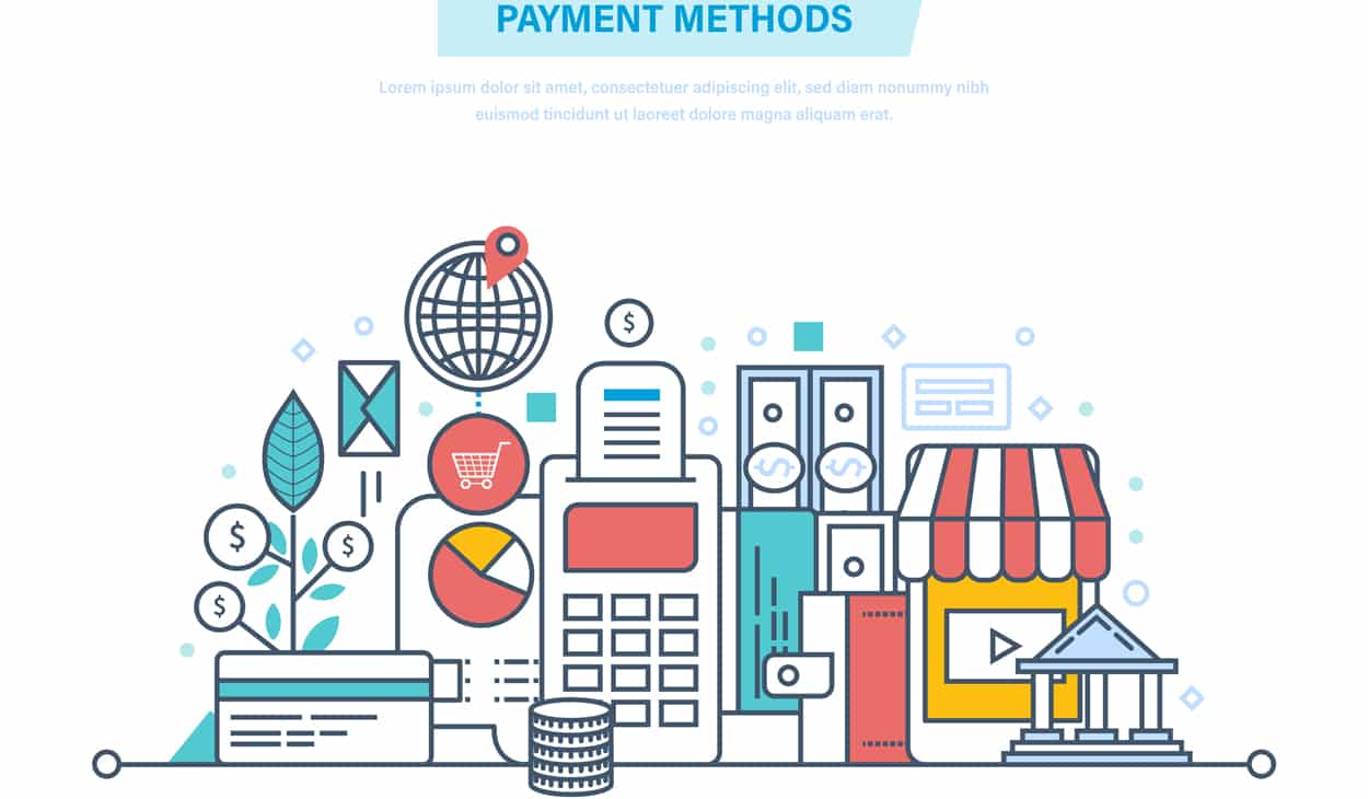
Is Your Payment Process Problematic? Payment Process Checkout Experience Your...
How Do I Get Started With A Google Remarketing Campaign?...
Current Trends in Website Marketing Strategies A Successful Website Trends...
How Can I Build My Brand with Internet Marketing? Build...
Why is Shopping Cart Development Important? Online Businesses The Shopping...
Which Retargeting Company is the Best? “Best” Retargeting Company What...
Developing Website Marketing Strategies How Website Design Impacts on Your...
Ways To Make Your Online Shopping Website Design Unique Online...
How To Find Good Web Designers Working With Web Designers...
6 Pay Per Click Advertisement Tips For Startups Pay Per...
Don’t Fall For SEO Canada Firm Rankings – Here Is...
Can Search Engines Crawl And Index JavaScript? 5 Important Questions...
The Relationship Between PPC And SEO Purpose of SEO and...
SEO Companies & Relationships Do SEO Companies Really Have Special...
Guide To SEO for E-Commerce Websites The Importance of SEO...
Essential Elements For Ecommerce Website What Is WordPress? I Need...
Choosing The Best Web Design Company 5 Important Questions To...
Is PPC Advertisement Worth My Time? PPC Advertisement Catches Attention...
What’s Needed To Design High-Conversion Forms Common Mistakes to Avoid...
Tips For Designing An Innovative And Functional Website Navigation 5...
Keyword Research For Search Engine Optimization Keyword Research Optimizing Your...
What Is Canonicalization What is The Process of Canonicalization? Canonicalization...
Want to Create an Ideal Ecommerce Site? Here is What...
The Four Most Important Ranking Factors For SEO In Toronto...
Domain Authority and Links Local Search Ranking Search Engine Marketers...
Factors Determining Your Search Engine Optimization Needs SEO Factors Determine...
What Are The Best Free WordPress Plugins? Content Management System...
Features That Impact Your Adwords Advertising Performance Google AdWords AdWords...
Why Does Landing Page Design Matter? We are often asked...
Effective Types of Personalized Product Recommendations An E-commerce Store Effectively...
Website Marketing Services We Offer Effective Website Marketing Services Are...
SEO For Mobile Becoming Increasingly Important For Toronto Businesses Mobile...
SEO Tips When Targeting Queries With Low Search Volume High...
What Is Google AdWords And Why Should I Use It?...
Why Consider Bing for SEO Strategy? Search Engine On The...
Essential Elements For 404 Error Page A “Not Found” Page...